
Open Source Visualization of GPS Displacements for Earthquake Cycle Physics
November 10, 2016
Posted by Jimbo Wilson, Software Engineer, Google Big Picture Team and Brendan Meade, Professor, Harvard Department of Earth and Planetary Sciences
The Earth’s surface is moving, ever so slightly, all the time. This slow, small, but persistent movement of the Earth's crust is responsible for the formation of mountain ranges, sudden earthquakes, and even the positions of the continents. Scientists around the world measure these almost imperceptible movements using arrays of Global Navigation Satellite System (GNSS) receivers to better understand all phases of an earthquake cycle—both how the surface responds after an earthquake, and the storage of strain energy between earthquakes.
To help researchers explore this data and better understand the Earthquake cycle, we are releasing a new, interactive data visualization which draws geodetic velocity lines on top of a relief map by amplifying position estimates relative to their true positions. Unlike existing approaches, which focus on small time slices or individual stations, our visualization can show all the data for a whole array of stations at once. Open sourced under an Apache 2 license, and available on GitHub, this visualization technique is a collaboration between Harvard’s Department of Earth and Planetary Sciences and Google's Machine Perception and Big Picture teams.
Our approach helps scientists quickly assess deformations across all phases of the earthquake cycle—both during earthquakes (coseismic) and the time between (interseismic). For example, we can see azimuth (direction) reversals of stations as they relate to topographic structures and active faults. Digging into these movements will help scientists vet their models and their data, both of which are crucial for developing accurate computer representations that may help predict future earthquakes.
Classical approaches to visualizing these data have fallen into two general categories: 1) a map view of velocity/displacement vectors over a fixed time interval and 2) time versus position plots of each GNSS component (longitude, latitude and altitude).
 |  |
| Examples of classical approaches. On the left is a map view showing average velocity vectors over the period from 1997 to 2001[1]. On the right you can see a time versus eastward (longitudinal) position plot for a single station. |
Each of these approaches have proved to be informative ways to understand the spatial distribution of crustal movements and the time evolution of solid earth deformation. However, because geodetic shifts happen in almost imperceptible distances (mm) and over long timescales, both approaches can only show a small subset of the data at any time—a condensed average velocity per station, or a detailed view of a single station, respectively. Our visualization enables a scientist to see all the data at once, then interactively drill down to a specific subset of interest.
Our visualization approach is straightforward; by magnifying the daily longitude and latitude position changes, we show tracks of the evolution of the position of each station. These magnified position tracks are shown as trails on top of a shaded relief topography to provide a sense of position evolution in geographic context.
To see how it works in practice, let’s step through an an example. Consider this tiny set of longitude/latitude pairs for a single GNSS station, with the differing digits shown in bold:
Day Index | Longitude | Latitude |
0 | 139.06990407 | 34.949757897 |
1 | 139.06990400 | 34.949757882 |
2 | 139.06990413 | 34.949757941 |
3 | 139.06990409 | 34.949757921 |
4 | 139.06990413 | 34.949757904 |
If we were to draw line segments between these points directly on a map, they’d be much too small to see at any reasonable scale. So we take these minute differences and multiply them by a user-controlled scaling factor. By default this factor is 105.5 (about 316,000x).

To help the user identify which end is the start of the line, we give the start and end points different colors and interpolate between them. Blue and red are the default colors, but they’re user-configurable. Although day-to-day movement of stations may seem erratic, by using this method, one can make out a general trend in the relative motion of a station.
 |
| Close-up of a single station’s movement during the three year period from 2003 to 2006. |
However, static renderings of this sort suffer from the same problem that velocity vector images do; in regions with a high density of GNSS stations, tracks overlap significantly with one another, obscuring details. To solve this problem, our visualization lets the user interactively control the time range of interest, the amount of amplification and other settings. In addition, by animating the lines from start to finish, the user gets a real sense of motion that’s difficult to achieve in a static image.
We’ve applied our new visualization to the ~20 years of data from the GEONET array in Japan. Through it, we can see small but coherent changes in direction before and after the great 2011 Tohoku earthquake.
 |
| GPS data sets (in .json format) for both the GEONET data in Japan and the Plate Boundary Observatory (PBO) data in the western US are available at earthquake.rc.fas.harvard.edu. |
This short animation shows many of the visualization’s interactive features. In order:
- Modifying the multiplier adjusts how significantly the movements are magnified.
- We can adjust the time slider nubs to select a particular time range of interest.
- Using the map controls provided by the Google Maps JavaScript API, we can zoom into a tiny region of the map.
- By enabling map markers, we can see information about individual GNSS stations.
 |
| Station designated 960601 of Japan’s GEONET array is located on the island of Mikura-jima. Here we see the period from 2006 to 2012, with movement magnified 105.1 times (126,000x). |
To achieve fast rendering of the line segments, we created a custom overlay using THREE.js to render the lines in WebGL. Data for the GNSS stations is passed to the GPU in a data texture, which allows our vertex shader to position each point on-screen dynamically based on user settings and animation.
We’re excited to continue this productive collaboration between Harvard and Google as we explore opportunities for groundbreaking, new earthquake visualizations. If you’d like to try out the visualization yourself, follow the instructions at earthquake.rc.fas.harvard.edu. It will walk you through the setup steps, including how to download the available data sets. If you’d like to report issues, great! Please submit them through the GitHub project page.
Acknowledgments
We wish to thank Bill Freeman, a researcher on Machine Perception, who hatched the idea and developed the initial prototypes, and Fernanda Viégas and Martin Wattenberg of the Big Picture Team for their visualization design guidance.
References
[1] Loveless, J. P., and Meade, B. J. (2010). Geodetic imaging of plate motions, slip rates, and partitioning of deformation in Japan, Journal of Geophysical Research.
-
Labels:
- Open Source Models & Datasets
Other posts of interest
-
March 28, 2024
AutoBNN: Probabilistic time series forecasting with compositional bayesian neural networks- Algorithms & Theory ·
- Machine Intelligence ·
- Open Source Models & Datasets
-
March 19, 2024
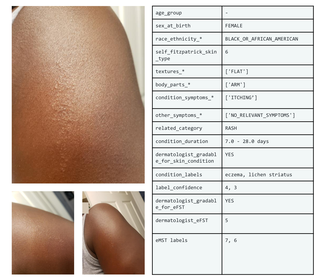
SCIN: A new resource for representative dermatology images- Education Innovation ·
- Health & Bioscience ·
- Open Source Models & Datasets
-

March 6, 2024
Croissant: a metadata format for ML-ready datasets- Machine Intelligence ·
- Open Source Models & Datasets