
Exploring and Visualizing an Open Global Dataset
August 25, 2017
Posted by Reena Jana, Creative Lead, Business Inclusion, and Josh Lovejoy, UX Designer, Google Research
Machine learning systems are increasingly influencing many aspects of everyday life, and are used by both the hardware and software products that serve people globally. As such, researchers and designers seeking to create products that are useful and accessible for everyone often face the challenge of finding data sets that reflect the variety and backgrounds of users around the world. In order to train these machine learning systems, open, global — and growing — datasets are needed.
Over the last six months, we’ve seen such a dataset emerge from users of Quick, Draw!, Google’s latest approach to helping wide, international audiences understand how neural networks work. A group of Googlers designed Quick, Draw! as a way for anyone to interact with a machine learning system in a fun way, drawing everyday objects like trees and mugs. The system will try to guess what their drawing depicts, within 20 seconds. While the goal of Quick, Draw! was simply to create a fun game that runs on machine learning, it has resulted in 800 million drawings from twenty million people in 100 nations, from Brazil to Japan to the U.S. to South Africa.
And now we are releasing an open dataset based on these drawings so that people around the world can contribute to, analyze, and inform product design with this data. The dataset currently includes 50 million drawings Quick Draw! players have generated (we will continue to release more of the 800 million drawings over time).
It’s a considerable amount of data; and it’s also a fascinating lens into how to engage a wide variety of people to participate in (1) training machine learning systems, no matter what their technical background; and (2) the creation of open data sets that reflect a wide spectrum of cultures and points of view.
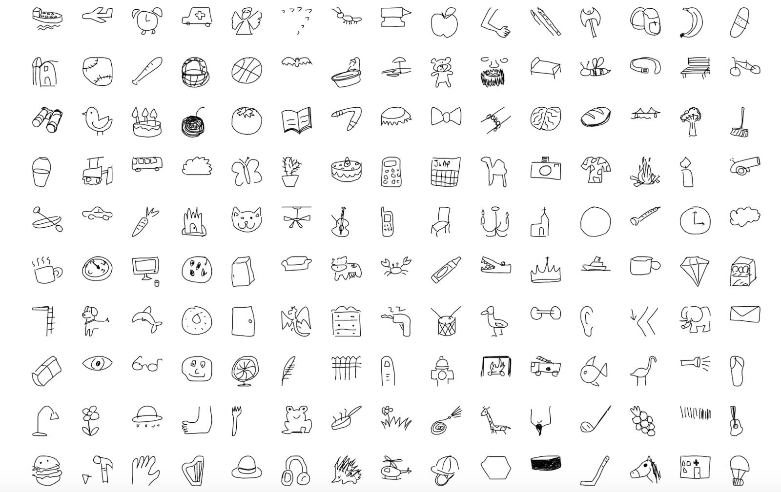
To understand visual patterns within the dataset quickly and efficiently, we worked with artist Kyle McDonald to overlay thousands of drawings from around the world. This helped us create composite images and identify trends in each nation, as well across all nations. We made animations of 1000 layered international drawings of cats and chairs, below, to share how we searched for visual trends with this data:
Cats, made from 1000 drawings from around the world:


These composite drawings, we realized, could reveal how perspectives and preferences differ between audiences from different regions, from the type of bread used in sandwiches to the shape of a coffee cup, to the aesthetic of how to depict objects so they are visually appealing. For example, a more straightforward, head-on view was more consistent in some nations; side angles in others.
Overlaying the images also revealed how to improve how we train neural networks when we lack a variety of data — even within a large, open, and international data set. For example, when we analyzed 115,000+ drawings of shoes in the Quick, Draw! dataset, we discovered that a single style of shoe, which resembles a sneaker, was overwhelmingly represented. Because it was so frequently drawn, the neural network learned to recognize only this style as a “shoe.”
But just as in the physical world, in the realm of training data, one size does not fit all. We asked, how can we consistently and efficiently analyze datasets for clues that could point toward latent bias? And what would happen if a team built a classifier based on a non-varied set of data?
Diagnosing data for inclusion
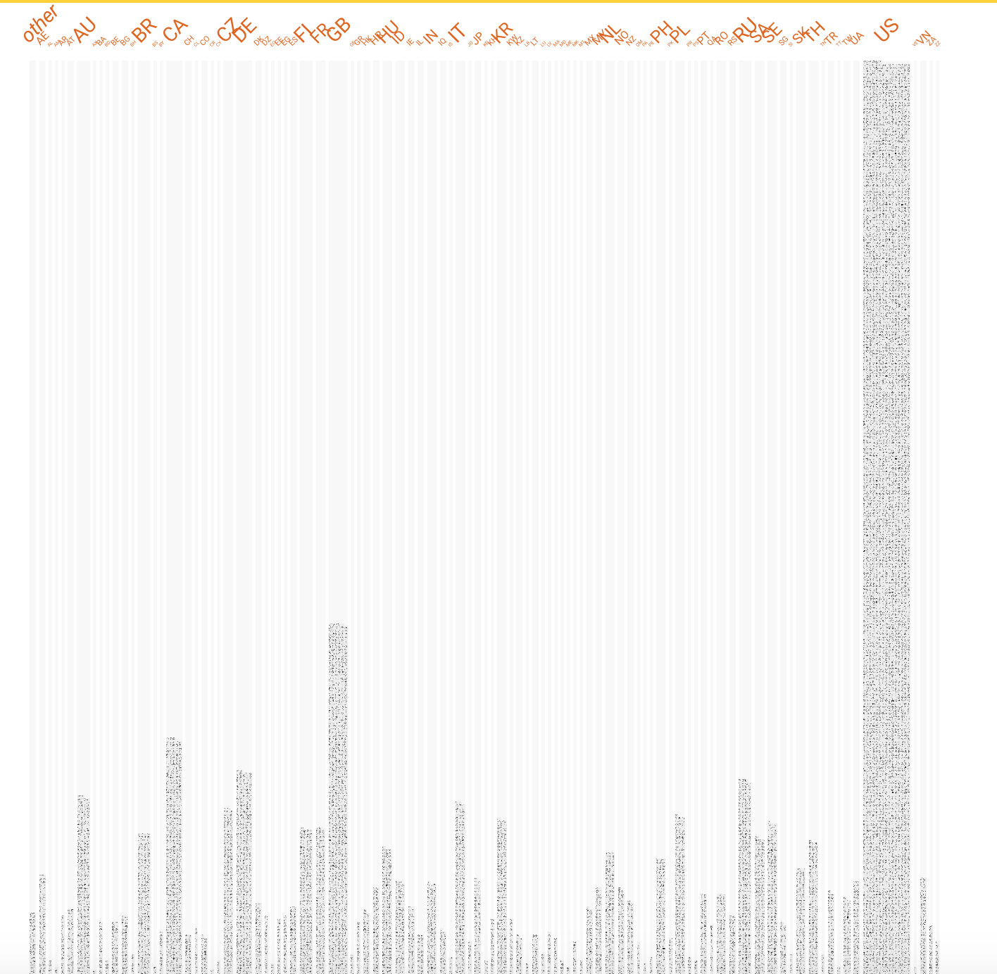
With the open source tool Facets, released last month as part of Google’s PAIR initiative, one can see patterns across a large dataset quickly. The goal is to efficiently, and visually, diagnose how representative large datasets, like the Quick, Draw! Dataset, may be.
Here’s a screenshot from the Quick,Draw! dataset within the Facets tool. The tool helped us position thousands of drawings by "faceting" them in multiple dimensions by their feature values, such as country, up to 100 countries. You, too, can filter for for features such as “random faces” in a 10-country view, which can then be expanded to 100 countries. At a glance, you can see proportions of country representations. You can also zoom in and see details of each individual drawing, allowing you to dive deeper into single data points. This is especially helpful when working with a large visual data set like Quick, Draw!, allowing researchers to explore for subtle differences or anomalies, or to begin flagging small-scale visual trends that might emerge later as patterns within the larger data set.

- Changing protocols for human rating of data or content generation, so that the data is more accurately representative of local or global populations
- Analyzing subgroups of data and identify the database equivalent of "intersectionality" surfaced within visual patterns
- Augmenting and reweighting data so that it is more inclusive
Acknowledgements
Jonas Jongejan, Henry Rowley, Takashi Kawashima, Jongmin Kim, Nick Fox-Gieg, built Quick, Draw! in collaboration with Google Creative Lab and Google’s Data Arts Team. The video about fairness in machine learning was created by Teo Soares, Alexander Chen, Bridget Prophet, Lisa Steinman, and JR Schmidt from Google Creative Lab. James Wexler, Jimbo Wilson, and Mahima Pushkarna, of PAIR, designed Facets, a project led by Martin Wattenberg and Fernanda Viégas, Senior Staff Research Scientists on the Google Brain team, and UX Researcher Jess Holbrook. Ian Johnson from the Google Cloud team contributed to the visualizations of overlaid drawings.
Other posts of interest
-
April 23, 2024
Safely repairing broken builds with ML- Machine Intelligence ·
- Software Systems & Engineering
-
April 12, 2024
Contrastive neural audio separation- Machine Intelligence ·
- Sound & Accoustics
-
April 11, 2024
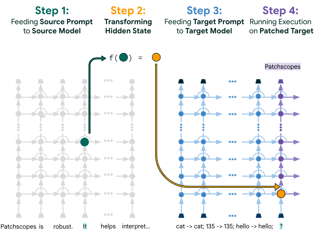
Patchscopes: A unifying framework for inspecting hidden representations of language models- Machine Intelligence ·
- Natural Language Processing ·
- Responsible AI