Setting Fairness Goals with the TensorFlow Constrained Optimization Library
February 21, 2020
Posted by Andrew Zaldivar, Responsible AI Advocate, Google Research, on behalf of the TFCO Team
Many technologies that use supervised machine learning are having an increasingly positive impact on peoples’ day-to-day lives, from catching early signs of illnesses to filtering inappropriate content. There is, however, a growing concern that learned models, which generally satisfy the narrow requirement of minimizing a single loss function, may have difficulty addressing broader societal issues such as fairness, which generally requires trading-off multiple competing considerations. Even when such factors are taken into account, these systems may still be incapable of satisfying such complex design requirements, for example that a false negative might be “worse” than a false positive, or that the model being trained should be “similar” to a pre-existing model.
The TensorFlow Constrained Optimization (TFCO) library makes it easy to configure and train machine learning problems based on multiple different metrics (e.g. the precisions on members of certain groups, the true positive rates on residents of certain countries, or the recall rates of cancer diagnoses depending on age and gender). While these metrics are simple conceptually, by offering a user the ability to minimize and constrain arbitrary combinations of them, TFCO makes it easy to formulate and solve many problems of interest to the fairness community in particular (such as equalized odds and predictive parity) and the machine learning community more generally.
How Does TFCO Relate to Our AI Principles?
The release of TFCO puts our AI Principles into action, further helping guide the ethical development and use of AI in research and in practice. By putting TFCO into the hands of developers, we aim to better equip them to identify where their models can be risky and harmful, and to set constraints that ensure their models achieve desirable outcomes.
What Are the Goals?
Borrowing an example from Hardt et al., consider the task of learning a classifier that decides whether a person should receive a loan (a positive prediction) or not (negative), based on a dataset of people who either are able to repay a loan (a positive label), or are not (negative). To set up this problem in TFCO, we would choose an objective function that rewards the model for granting loans to those people who will pay them back, and would also impose fairness constraints that prevent it from unfairly denying loans to certain protected groups of people. In TFCO, the objective to minimize, and the constraints to impose, are represented as algebraic expressions (using normal Python operators) of simple basic rates.
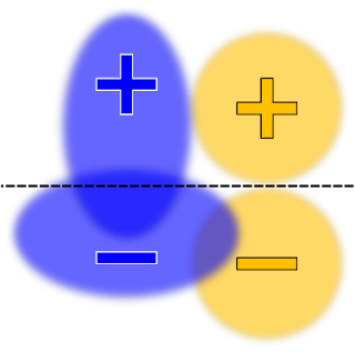
Instructing TFCO to minimize the overall error rate of the learned classifier for a linear model (with no fairness constraints), might yield a decision boundary that looks like this:
 |
| Illustration of a binary classification dataset with two protected groups: blue and orange. For ease of visualization, rather than plotting each individual data point, the densities are represented as ovals. The positive and negative signs denote the labels. The decision boundary drawn as a black dashed line separating positive predictions (regions above the line) and negative (regions below the line) labels, chosen to maximize accuracy. |
 |
| Here the decision boundary is chosen to maximize the accuracy, subject to an equal opportunity (or true positive rate) constraint. |
Choosing the “right” constraints depends on the policy goals or requirements of your problem and your users. For this reason, we’ve striven to avoid forcing the user to choose from a curated list of “baked-in” problems. Instead, we’ve tried to maximize flexibility by enabling the user to define an extremely broad range of possible problems, by combining and manipulating simple basic rates.
This flexibility can have a downside: if one isn’t careful, one might attempt to impose contradictory constraints, resulting in a constrained problem with no good solutions. In the context of the above example, one could constrain the false positive rates (FPRs) to be equal, in addition to the true positive rates (TPRs) (i.e., “equalized odds”). However, the potentially contradictory nature of these two sets of constraints, coupled with our requirement for a linear model, could force us to find a solution with extremely low accuracy. For example:
 |
| Here the decision boundary is chosen to maximize the accuracy, subject to both the true positive rate and false positive rate constraints. |
Can It Fail?
The ability to express many fairness goals as rate constraints can help drive progress in the responsible development of machine learning, but it also requires developers to carefully consider the problem they are trying to address. For example, suppose one constrains the training to give equal accuracy for four groups, but that one of those groups is much harder to classify. In this case, it could be that the only way to satisfy the constraints is by decreasing the accuracy of the three easier groups, so that they match the low accuracy of the fourth group. This probably isn’t the desired outcome.
A “safer” alternative is to constrain each group to independently satisfy some absolute metric, for example by requiring each group to achieve at least 75% accuracy. Using such absolute constraints rather than relative constraints will generally keep the groups from dragging each other down. Of course, it is possible to ask for a minimum accuracy that isn’t achievable, so some conscientiousness is still required.
The Curse of Small Sample Sizes
Another common challenge with using constrained optimization is that the groups to which constraints are applied may be under-represented in the dataset. Consequently, the stochastic gradients we compute during training will be very noisy, resulting in slow convergence. In such a scenario, we recommend that users impose the constraints on a separate rebalanced dataset that contains higher proportions from each group, and use the original dataset only to minimize the objective.
For example, in the Wiki toxicity example we provide, we wish to predict if a discussion comment posted on a Wiki talk page is toxic (i.e., contains “rude, disrespectful or unreasonable” content). Only 1.3% of the comments mention a term related to “sexuality”, and a large fraction of these comments are labelled toxic. Hence, training a CNN model without constraints on this dataset leads to the model believing that “sexuality” is a strong indicator of toxicity and results in a high false positive rate for this group. We use TFCO to constrain the false positive rate for four sensitive topics (sexuality, gender identity, religion and race) to be within 2%. To better handle the small group sizes, we use a “re-balanced” dataset to enforce the constraints and the original dataset only to minimize the objective. As shown below, the constrained model is able to significantly lower the false positive rates on the four topic groups, while maintaining almost the same accuracy as the unconstrained model.
 |
| Comparison of unconstrained and constrained CNN models for classifying toxic comments on Wiki Talk pages. |
Overlapping constraints can help create equitable experiences for multiple categories of historically marginalized and minority groups. Extending beyond the above example, we also provide a CelebA example that examines a computer vision model for detecting smiles in images that we wish to perform well across multiple non-mutually-exclusive protected groups. The false positive rate can be an appropriate metric here, since it measures the fraction of images not containing a smiling face that are incorrectly labeled as smiling. By comparing false positive rates based on available age group (young and old) or sex (male and female) categories, we can check for undesirable model bias (i.e., whether images of older people that are smiling are not recognized as such).
 |
| Comparison of unconstrained and constrained smiling detection classifier across age group categories. |
Correctly handling rate constraints is challenging because, being written in terms of counts (e.g., the accuracy rate is the number of correct predictions, divided by the number of examples), the constraint functions are non-differentiable. Algorithmically, TFCO converts a constrained problem into a non-zero-sum two-player game (ALT’19, JMLR’19). This framework can be extended to handle the ranking and regression settings (AAAI’20), more complex metrics such as the F-measure (NeurIPS’19a), or to improve generalization performance (ICML’19).
It is our belief that the TFCO library will be useful in training ML models that take into account the societal and cultural factors necessary to satisfy real-world requirements. Our provided examples (toxicity classification and smile detection) only scratch the surface. We hope that TFCO’s flexibility enables you to handle your problem’s unique requirements.
Acknowledgements
This work was a collaborative effort by the authors of TFCO and associated research papers, including Andrew Cotter, Maya R. Gupta, Heinrich Jiang, Harikrishna Narasimhan, Taman Narayan, Nathan Srebro, Karthik Sridharan, Serena Wang, Blake Woodworth, and Seungil You.
Other posts of interest
-
April 23, 2024
Safely repairing broken builds with ML- Machine Intelligence ·
- Software Systems & Engineering
-

April 19, 2024
Improving Gboard language models via private federated analytics- Algorithms & Theory ·
- Distributed Systems & Parallel Computing ·
- Product ·
- Security, Privacy and Abuse Prevention
-
April 12, 2024
Contrastive neural audio separation- Machine Intelligence ·
- Sound & Accoustics